We don't just take pictures with a camera, we bring to the act of photography all the books we've read, the movies we've seen, the music we've heard, the places we've been, and the people we've loved.
Preface#
In the blink of an eye, it's already the end. Eight episodes went by so quickly, I didn't get enough 😫.
Personally, I think the story of this season is very exciting. Apart from the rushed plot development, the portrayal of the relationship between machines and humans, beliefs and differences, friendship and morality in the series is spot on. The final ending is also perfect, and I sincerely hope there won't be a fourth season. For Easter eggs in the series, you can check out the detailed analysis by Star Wars Fans1: Detailed Analysis of "The Mandalorian" Season 3 (in chronological order: Detailed Analysis).
This season not only has an engaging plot, but also has well-developed character details. Many scenes are visually stunning and very pleasing to the eye. In this article, I will extract some stills and analyze the secrets behind the visual presentation in the film, and share with you the aesthetic principles of color and composition, in order to enhance your photography and post-production skills.
Composition#
The composition in the film is very interesting, and the underlying concepts and aesthetic principles are worth learning from.
Visual Extension#
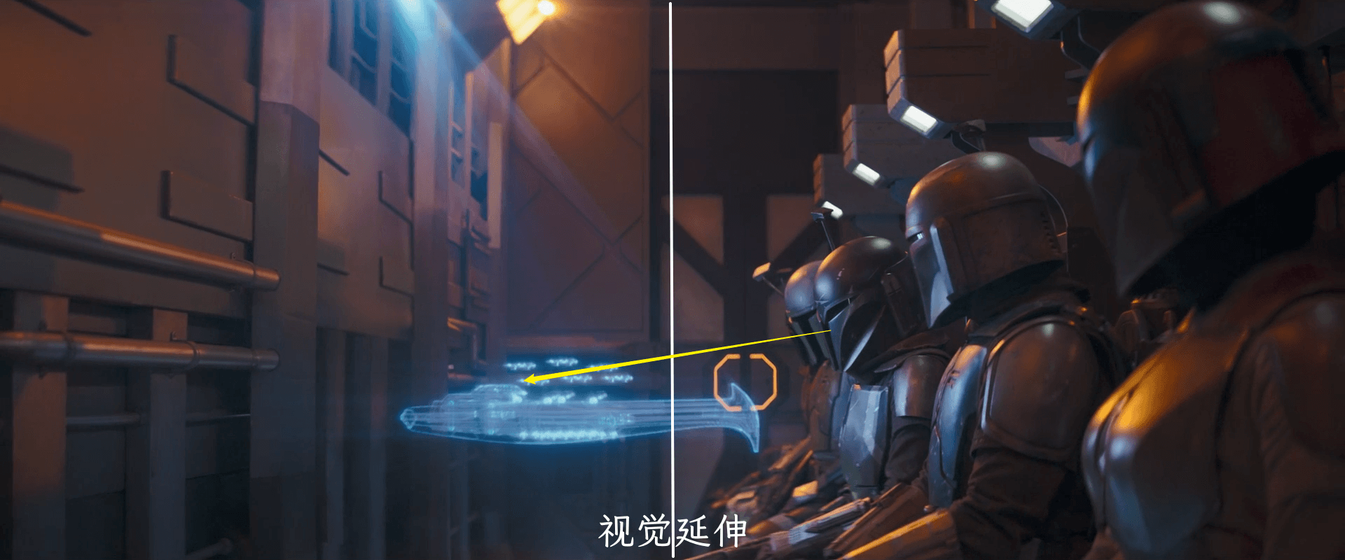
Visual extension is a special form of negative space, usually referring to the negative space in the direction of movement or line of sight. When viewers look at a photo, they tend to move forward or extend in the direction of movement or line of sight, so they need enough space as a buffer. On the contrary, if there are obstacles or other irrelevant elements in front, it often creates a sense of abruptness. The general principle is that the "front" space should be larger than the "back" space2.
When the characters in the image are not facing or turning away from the camera, the composition of the image needs to be balanced based on their line of sight. For example, in the image below, Grogu (formerly known as Din Grogu, hereinafter referred to as "Grogu") is looking to the left, so in order to balance the overall image, some space needs to be left on the left.

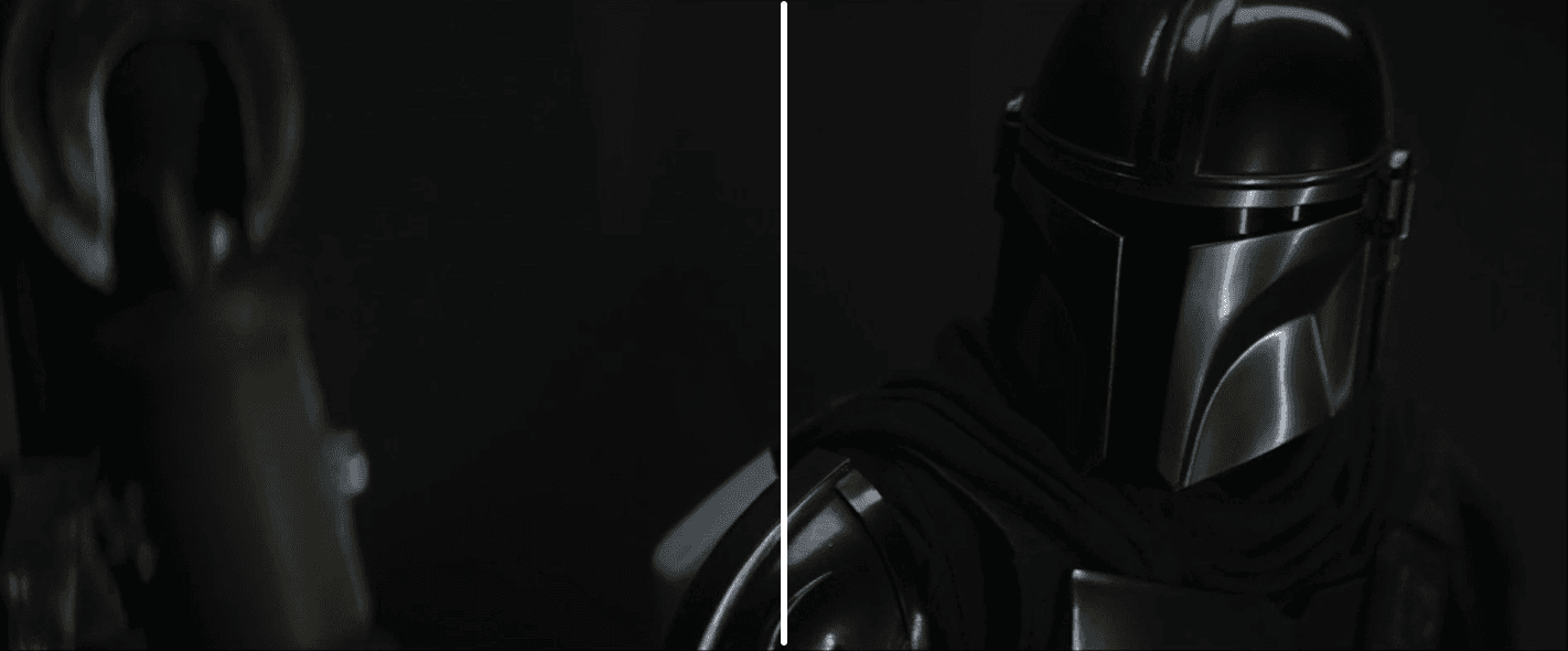
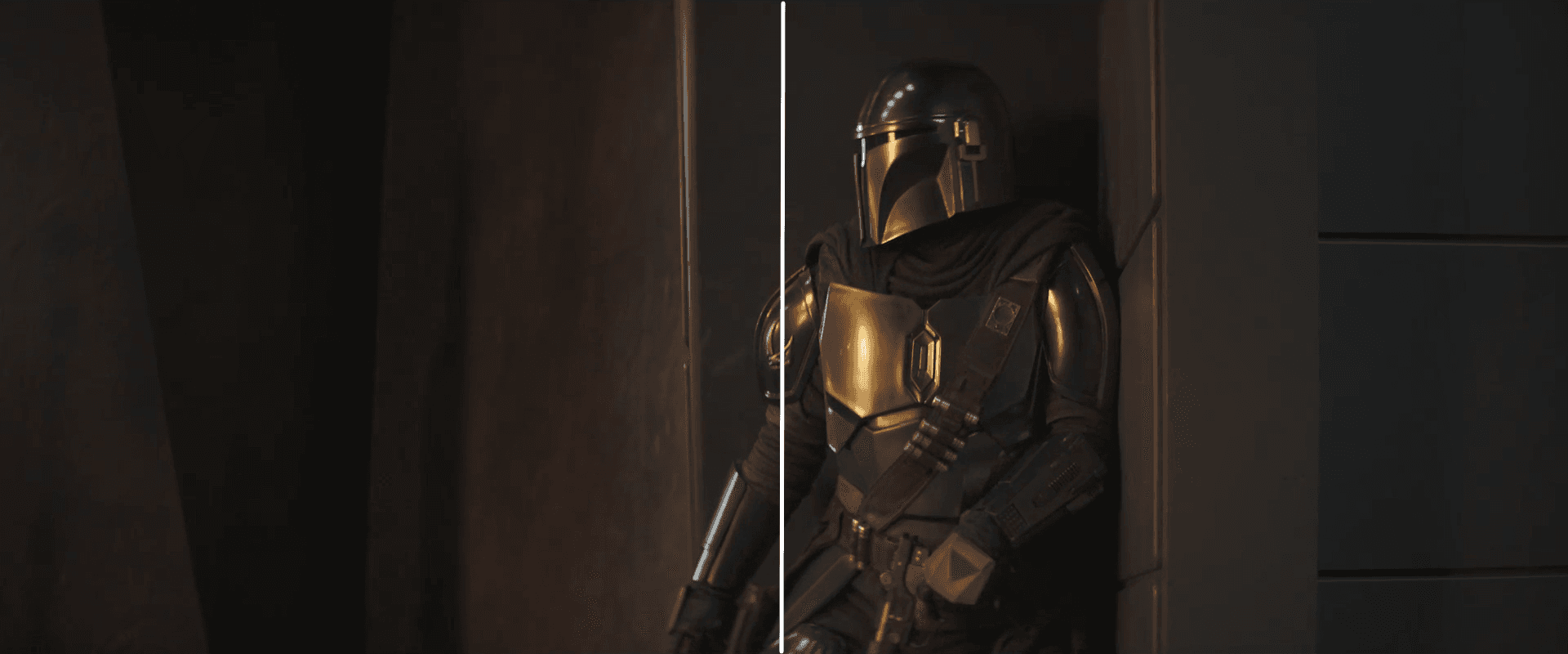
The film has a relatively large aspect ratio. In this film, this visual extension composition is used many times:

Practice and Experimentation#
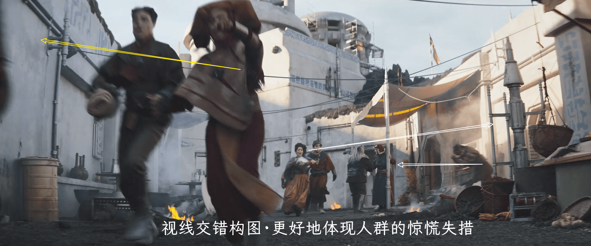
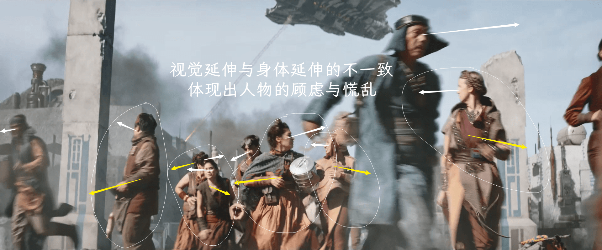
Visual Interplay#
By using different perspectives, the characteristics of the characters can be effectively portrayed:
Balance of Real and Virtual (Depth of Field)#
The beauty of reality lies in the virtual, so three-tenths of it is arranged in the sky and earth, and seven-tenths of it is locked in clouds and smoke. - Jiao He, "Miscellaneous Thoughts on Learning to Paint"
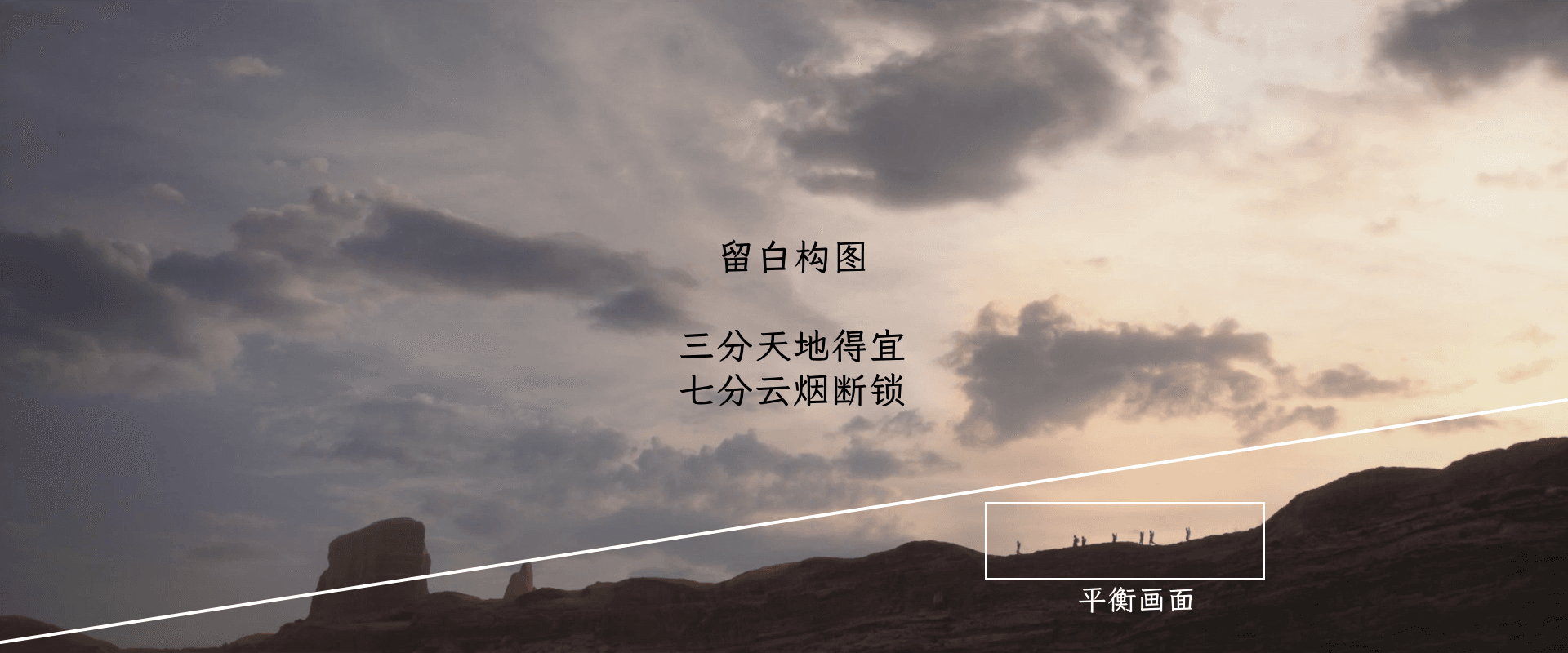
The combination of reality and virtuality, also known as negative space, plays an extremely important role in both photography and painting. Laozi said, "Know the white, keep the black." This means that black (real) emerges from white (virtual), and with the virtual, the real can stand out.
Regarding the concept of reality and virtuality, Mr. Pan Tianshou said in his book "On Composition": "When our eyes look at things, they must obey the commands of the brain. When the brain commands us to look at something, we pay attention to that thing. When the brain commands us to look at a certain point of that thing, we pay attention to that point and ignore the others. For example, when we look at a person's face, we forget about the body. When we see the nose, we tend to ignore the mouth. It is impossible for us to miss anything within the field of vision like a camera. This is the principle of "being absent-minded and seeing without seeing" mentioned in the Analects. Isn't it a limitation of the energy of the eyes? Chinese painting is based on the principle of seeing without seeing. If there is nothing to see, there is blankness. With blankness, there is a place that does not need attention, and the subject can be more focused and prominent."
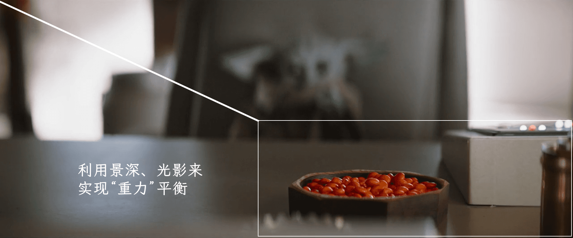
In photography, the most direct manifestation of reality and virtuality is depth of field: depth of field refers to the clear depth range in a photo, which is the range between the focus point and the foreground and background. The size of the depth of field depends on factors such as aperture, focal length, and the distance between the camera and the subject.
- Focus on a subject - for reality
- Blurred background - for virtual
The composition of the candy tray in the image below demonstrates this principle well:
This shot uses depth of field and color to create a sense of oppression:
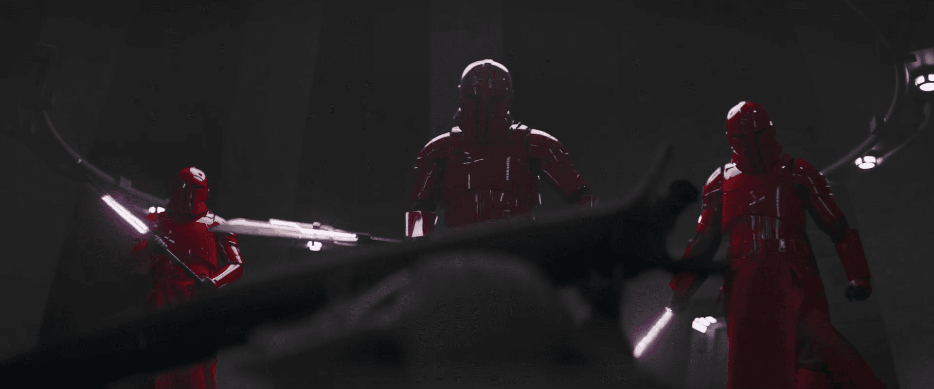
Similar compositions are used to highlight the subject:
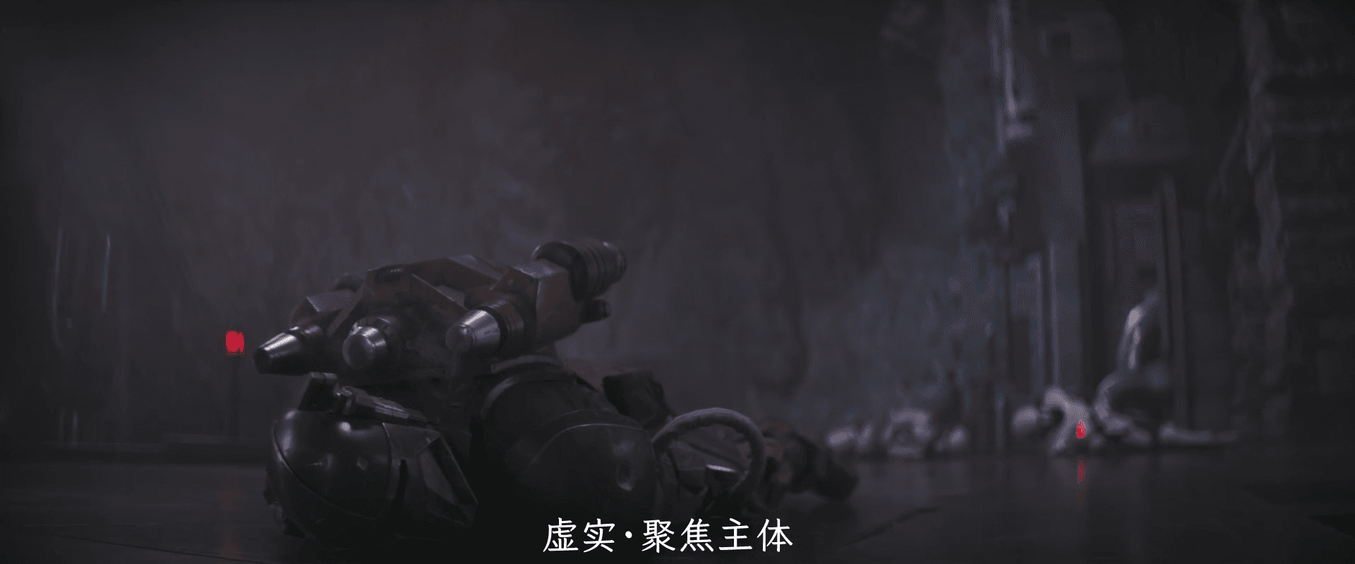
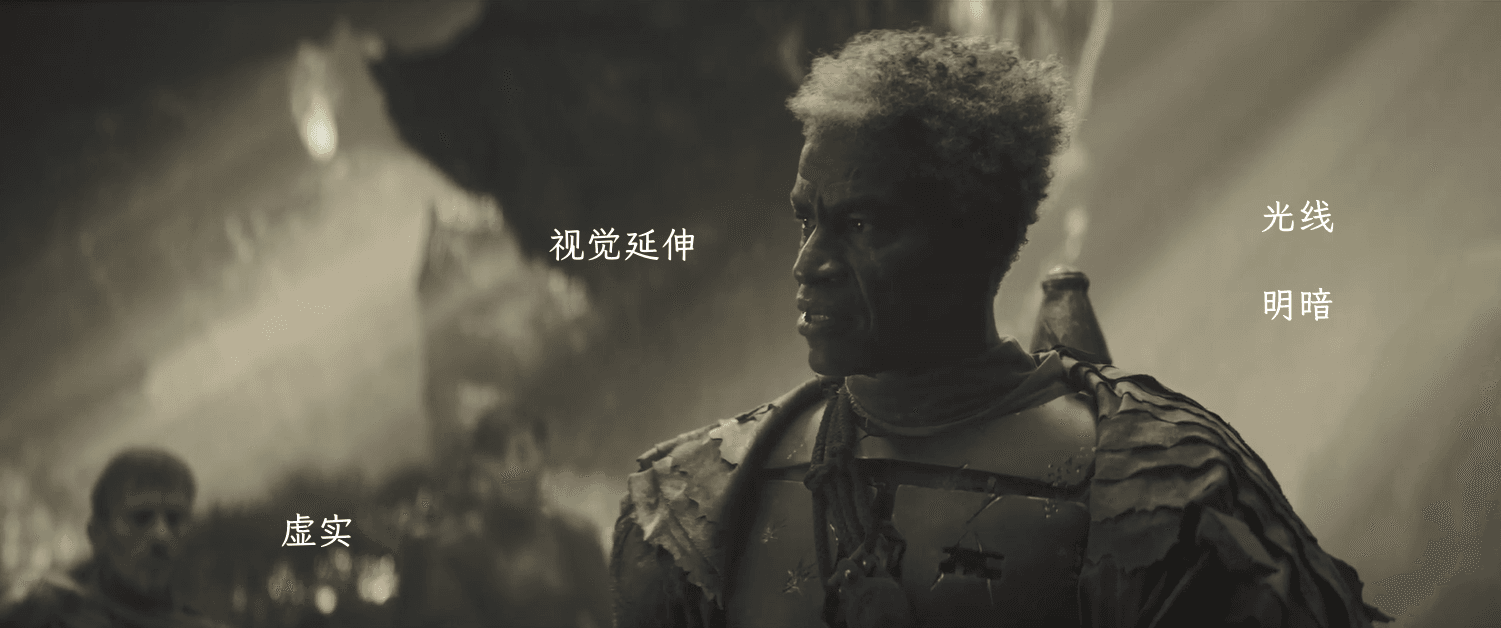

Application#
So how can we use reality and virtuality to improve our expression?
The answer is undoubtedly adjusting the depth of field, which can be done through three methods: focal length, aperture, and distance.
- Focal Length
Generally speaking, the depth of field effect of a telephoto lens is shallower than that of a wide-angle lens, so a shallow depth of field can be achieved by using a telephoto lens. In addition, the effect of automatic focus on cameras is sometimes less accurate than manual focus. For special shooting environments and requirements, manual focus can be used to adjust the focus and depth of field.
2. Aperture
Different apertures can create different depths of field. The larger the aperture, the more light passes through, and the more light enters the camera, resulting in a shorter virtual-to-real focal length of the lens, and therefore a shallower depth of field. The smaller the aperture, the less light passes through, and the less light enters the camera, resulting in a longer virtual-to-real focal length of the lens, and therefore a deeper depth of field.
3. Distance
Adjust the shooting distance: when approaching the subject, the depth of field becomes shallower; when moving away from the subject, the depth of field becomes deeper. Therefore, you can adjust the distance between the subject and the camera by getting closer or further away to adjust the depth of field.
Contrast Composition#
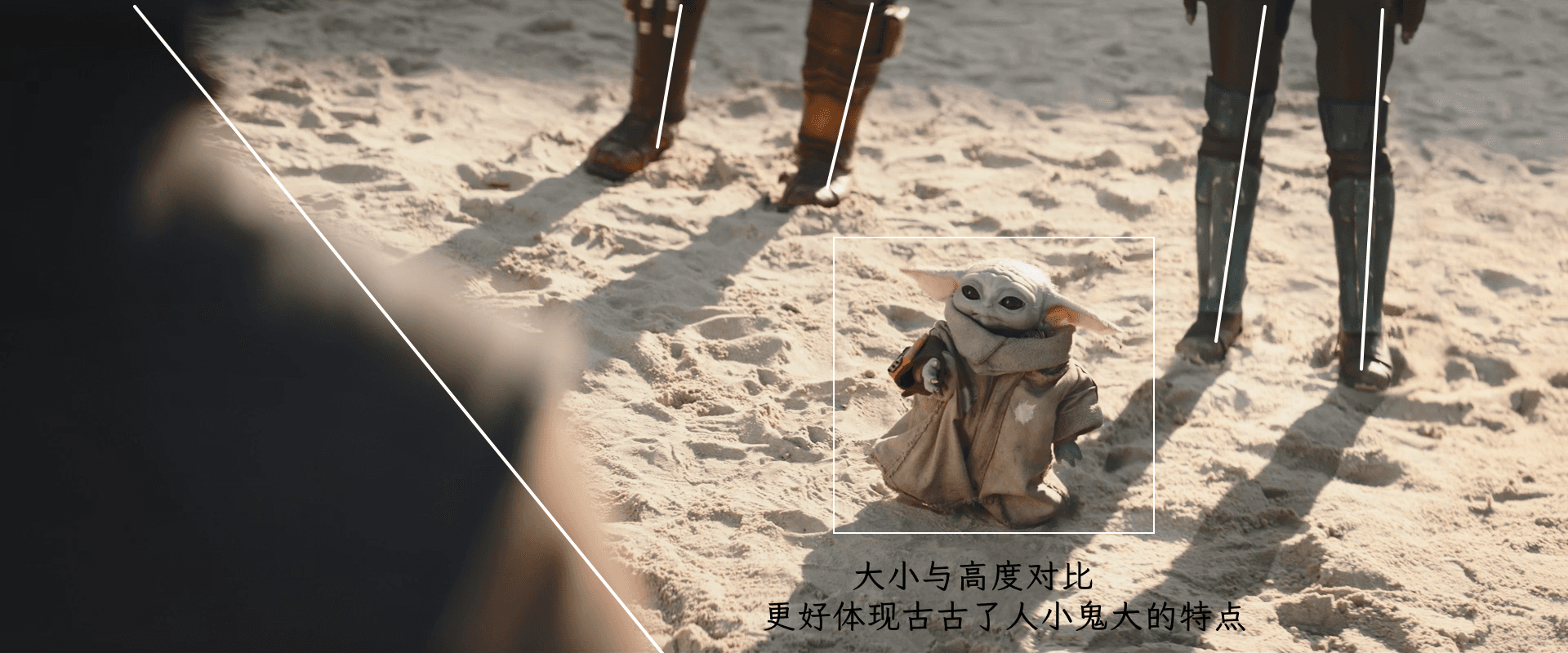
Contrast composition is a technique that uses strong contrasts in color, shape, size, density, and reality and virtuality to create visual impact and expressiveness. It captures the viewer's attention and interest.
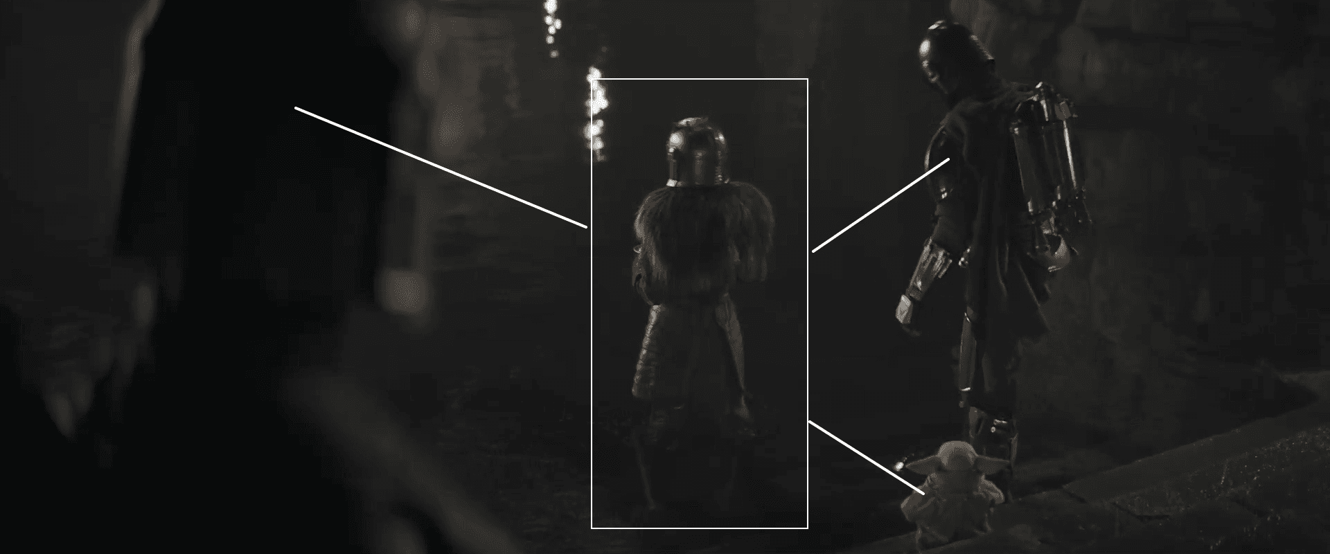
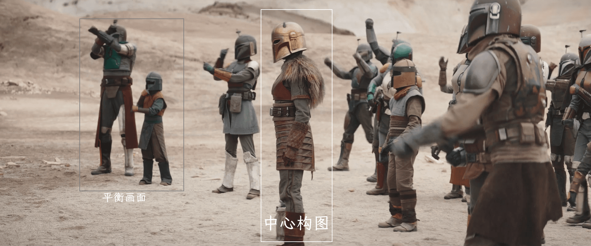
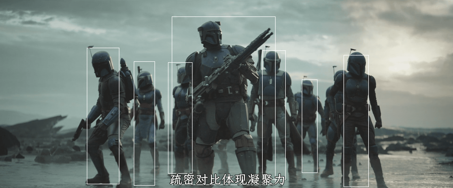
In the film, the decorations and personality of the blacksmith are unique, and they are also key characters in the plot. Many contrast compositions are used to highlight their characteristics. For example, the image below centers around the blacksmith, with many Mandalorians distributed around. This combination of density and sparsity not only highlights the character's traits, but also expresses the cohesion of the group:
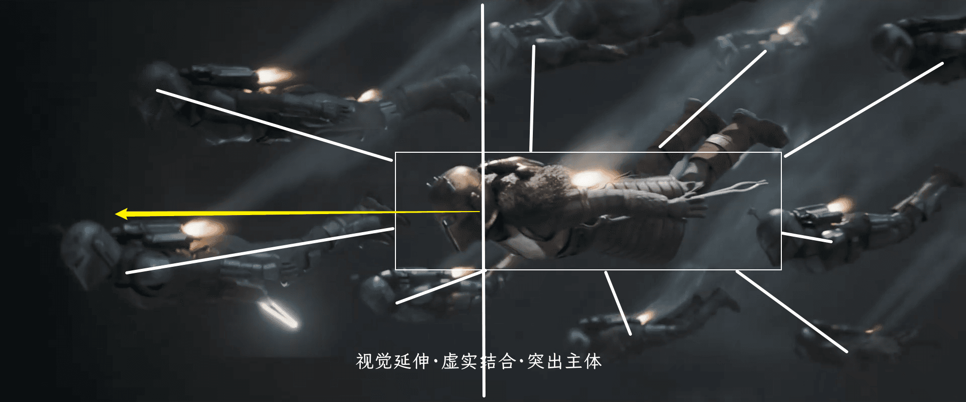
The following two images particularly highlight a sense of ceremony and the blacksmith's calm personality:
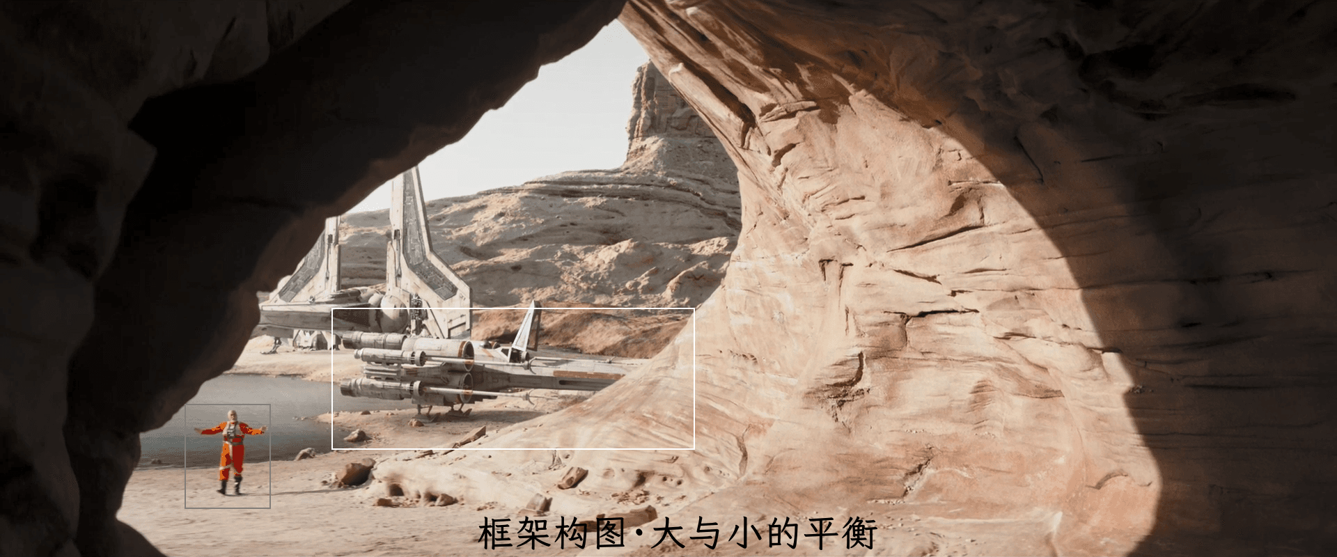
Framing Composition#
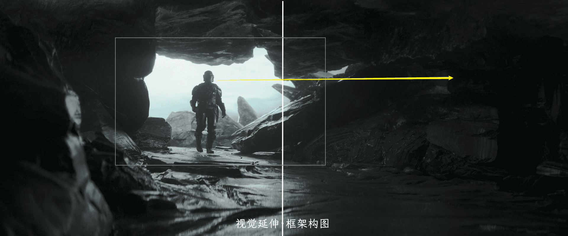
This composition technique allows the focus to be on the subject. The center of the frame naturally becomes the convergence point of the main visual line, allowing for quick capture of the main subject and visual center. It is concise and clear, with simple and distinct spatial arrangement that does not disturb the visual line, conveying direct and easy-to-understand information.
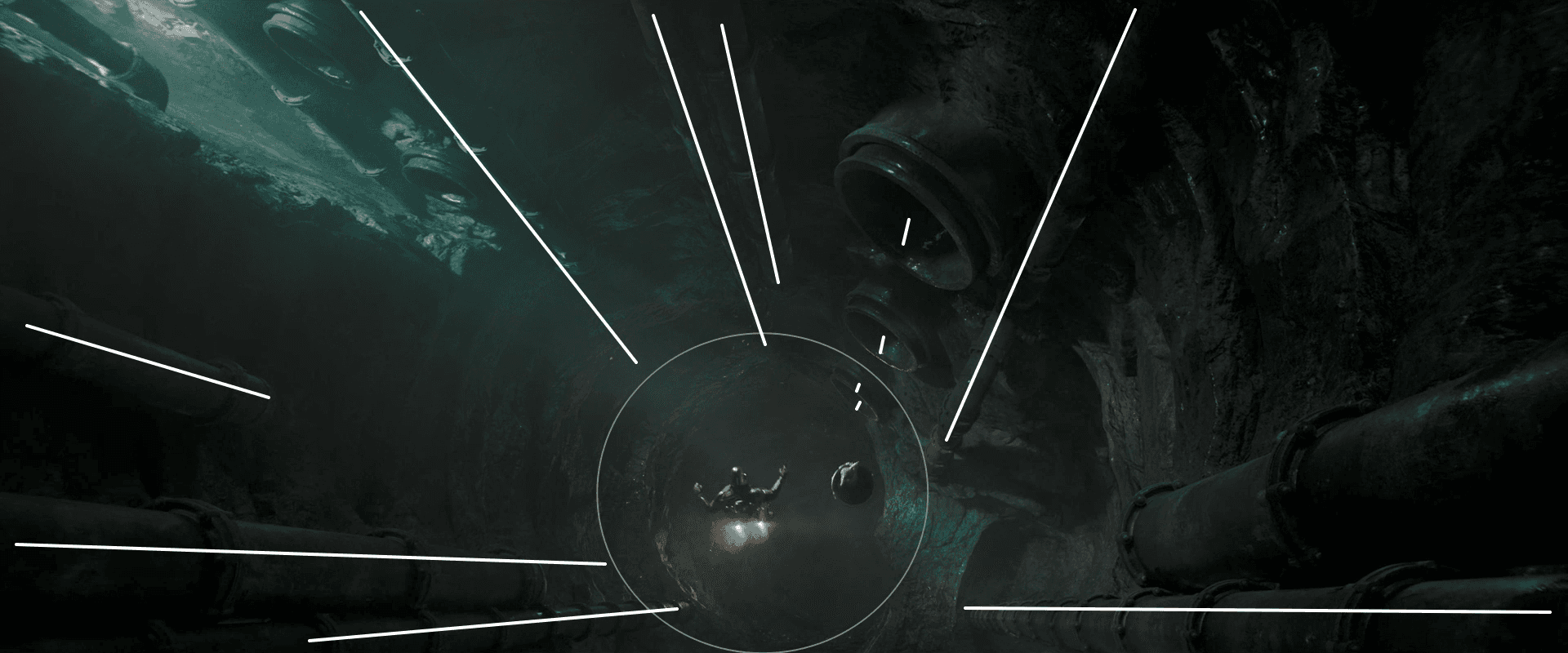
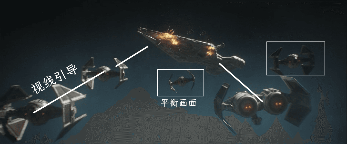
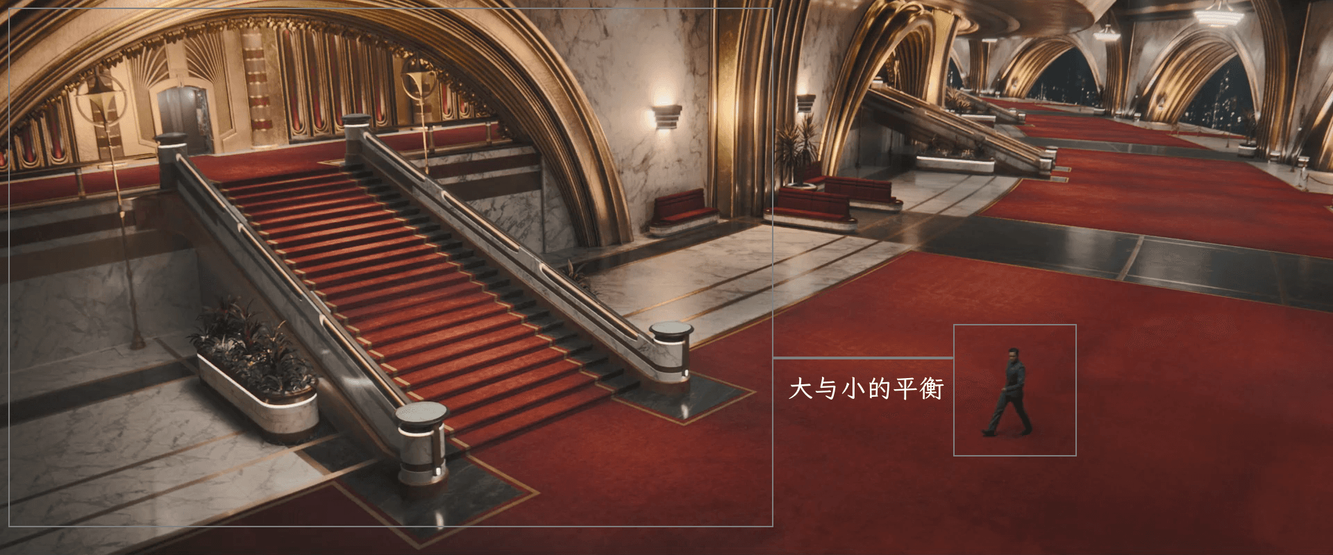
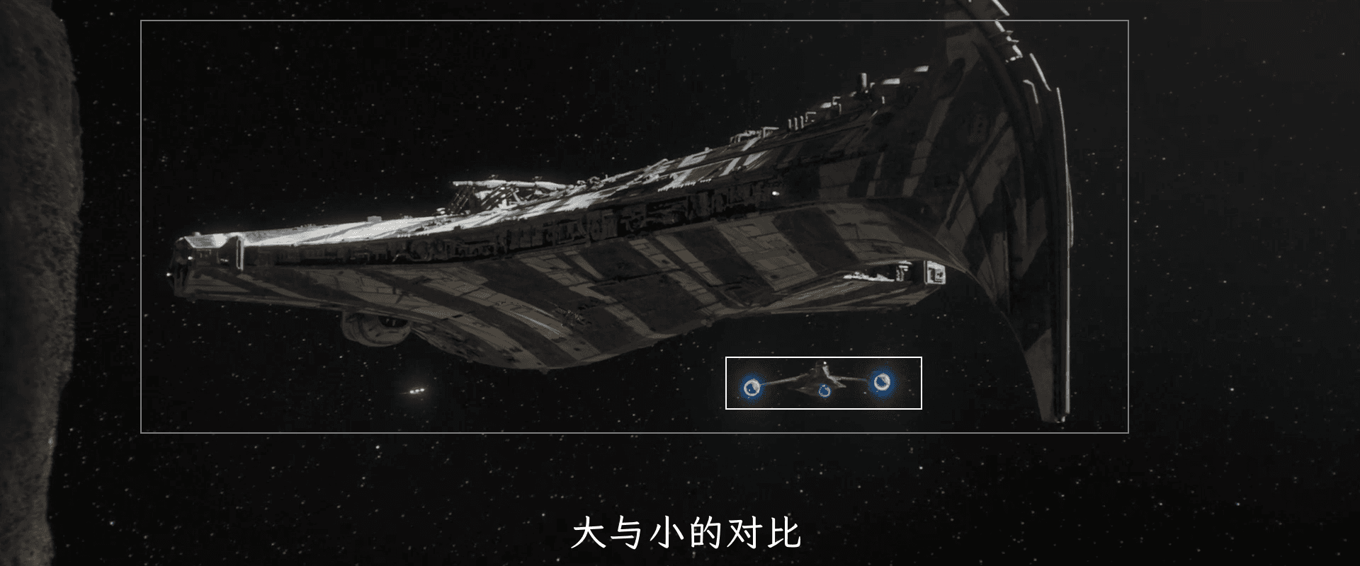
Mechanical Balance#
This composition uses the combination of different objects to achieve overall balance. It requires careful post-processing.
Color Scheme#
Let's start with the color scheme. The most important aspect of science fiction films is the color scheme. Colors that match the imagination undoubtedly add brilliance to the scenes and convey ideas more effectively. The choice of color scheme often reflects the creativity of the director and cinematographer, and it affects the viewer's visual experience and psychological perception.
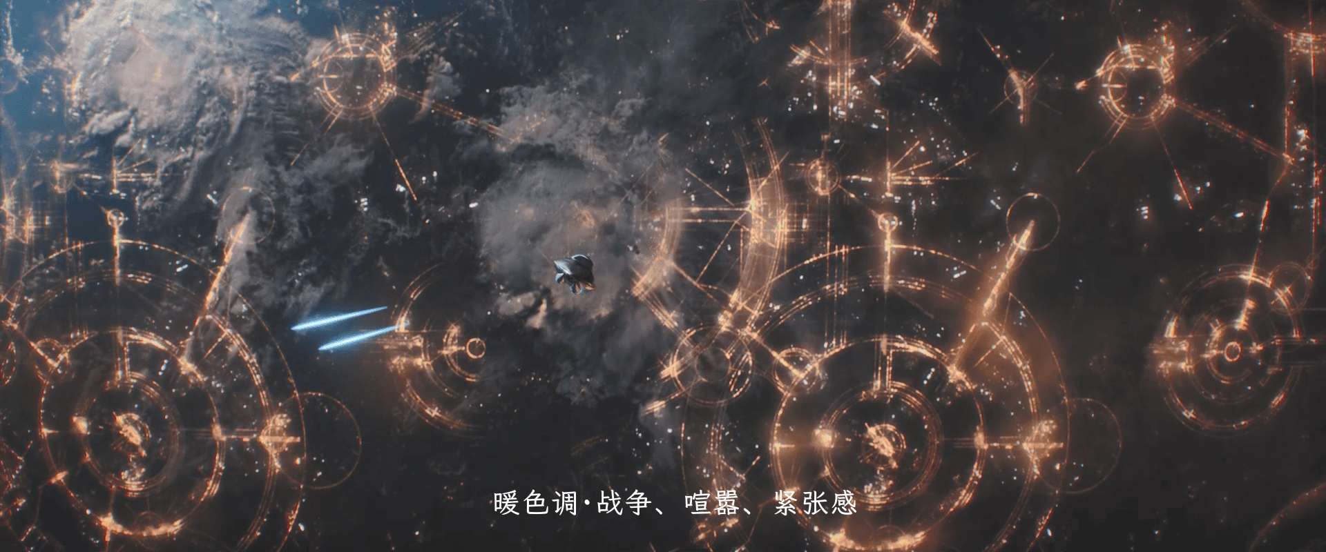
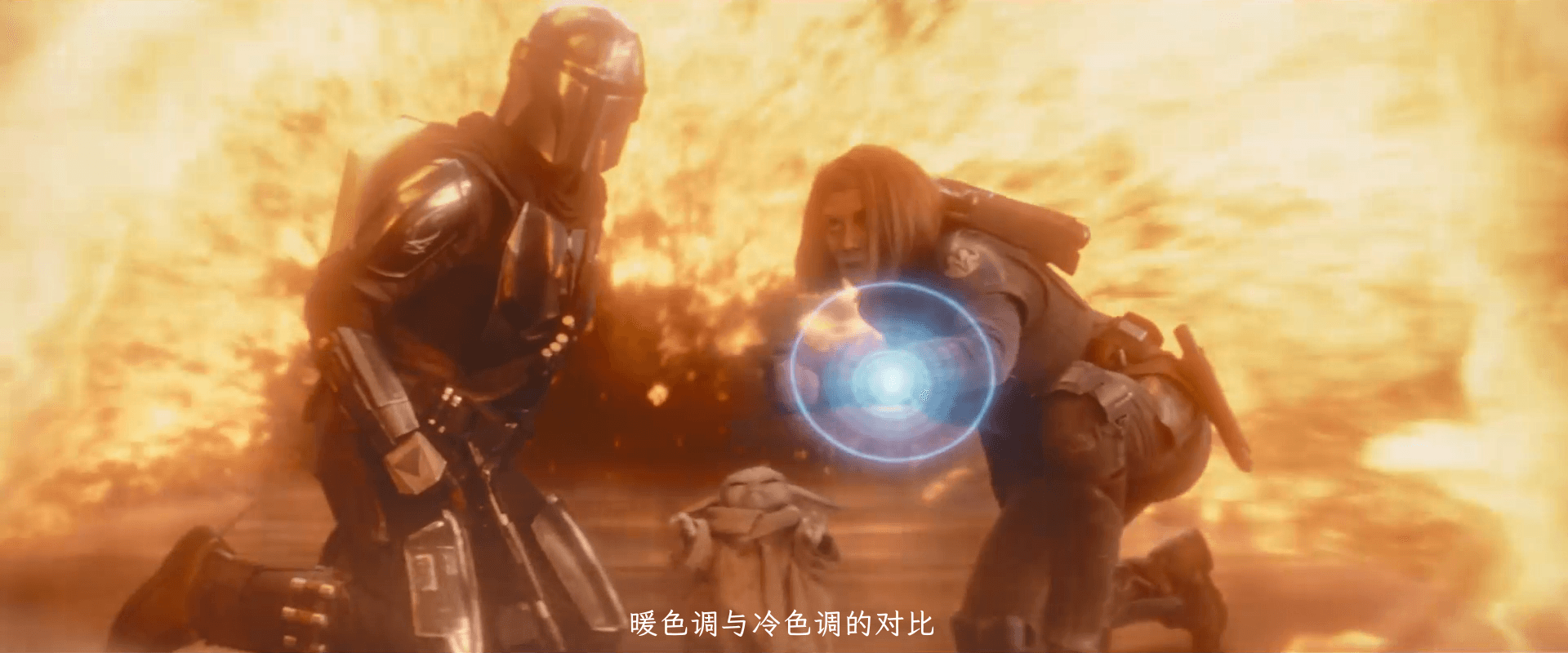
Warm Color Scheme#
Mainly red and orange, usually representing energy or vitality, giving stimulation and a sense of tension.

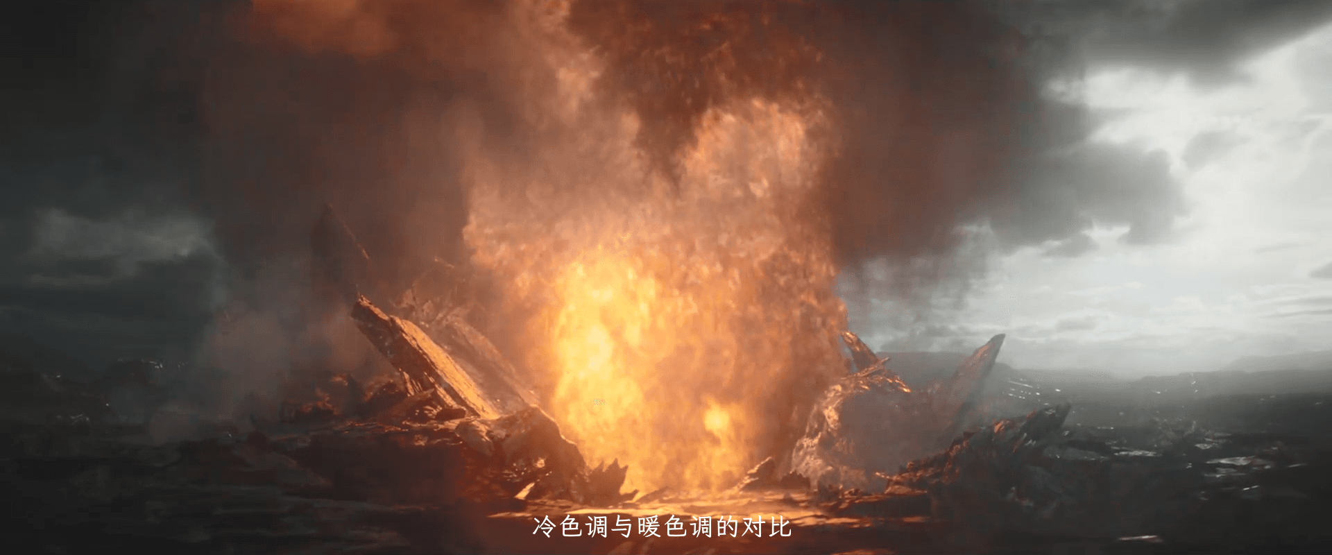
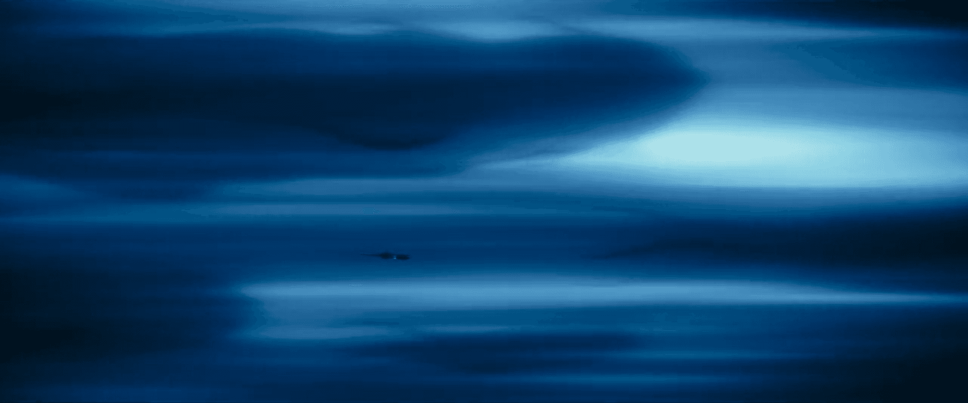
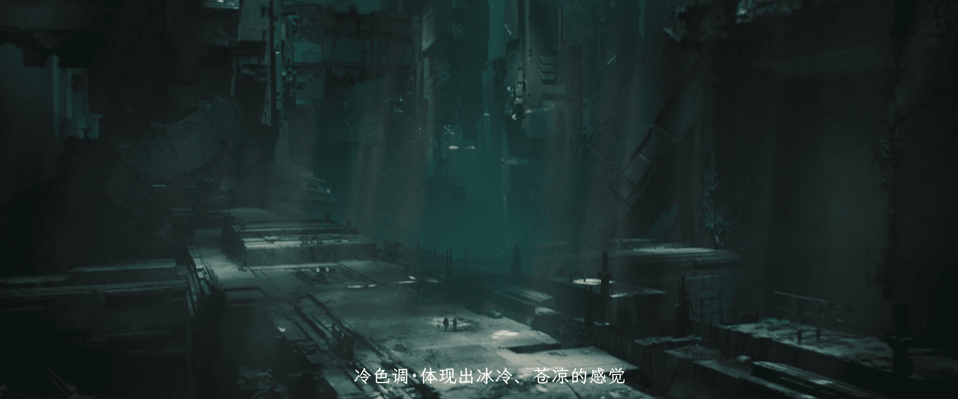
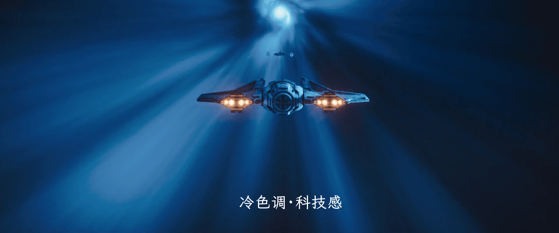
Cool Color Scheme#
Mainly blue and gray, giving a sense of coldness, futurism, or otherworldliness, creating a mysterious and profound atmosphere.
The navigation in hyperspace, the whale, the desolation, and the sense of loneliness:
Other Color Schemes#
Simple color schemes and simple lighting can highlight the details of the characters:
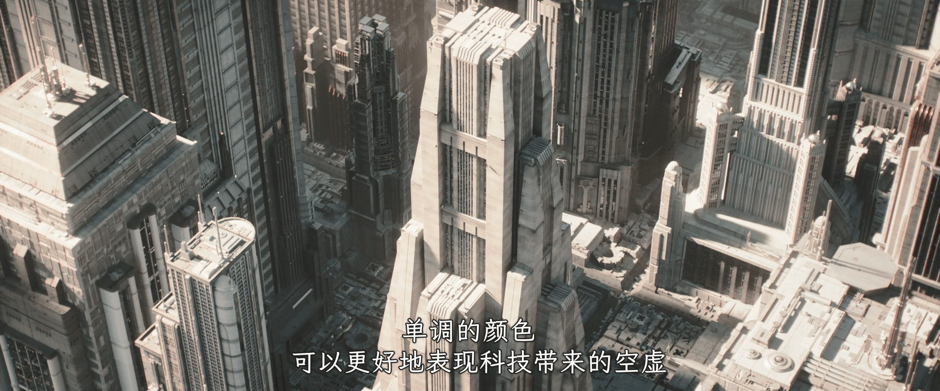
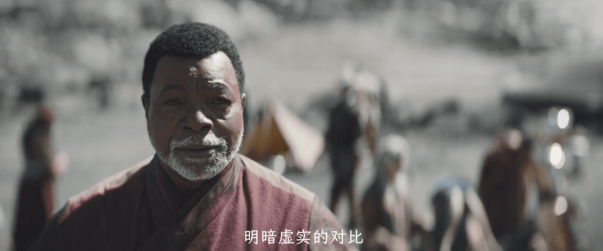
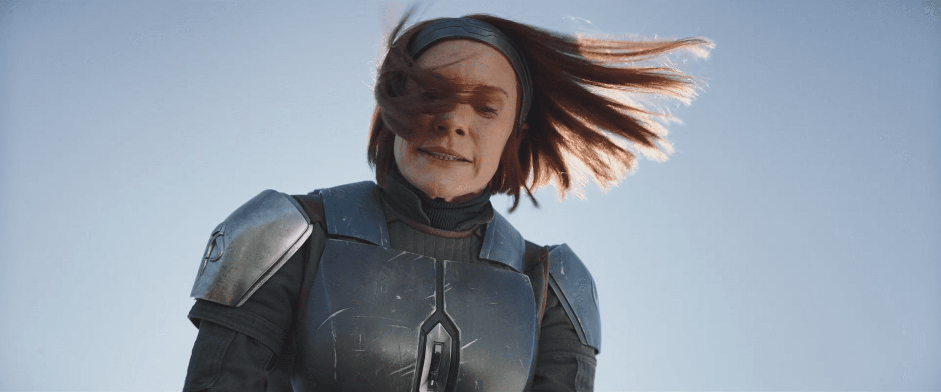
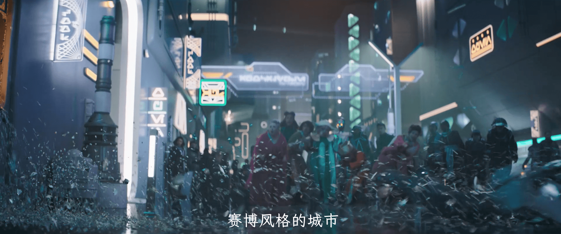
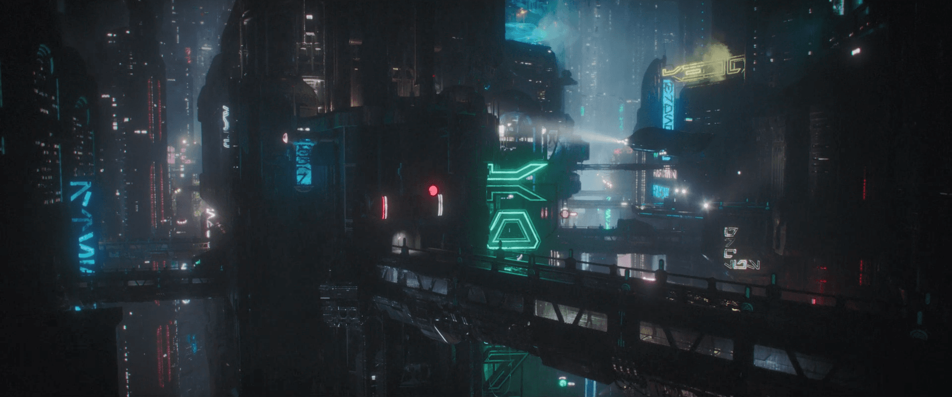
Cyberpunk style is a style that has regained popularity in recent years. It is mainly based on the neon lights of Hong Kong style, and is mainly used in crime and chase scenes (how sad).
Footnotes#
-
The founder of Star Wars Chinese website, who is extremely knowledgeable about all events, items, and characters in Star Wars. He is known as the "Star Wars Guru". Every time a new live-action series is released, the Star Wars Guru provides detailed analysis on Douban and the Chinese website, which is a blessing for Star Wars fans. ↩
-
Ma Hongwei. Perfect Composition. Tsinghua University Press, 2014-6-1, https://book.douban.com/subject/25876160/. ↩